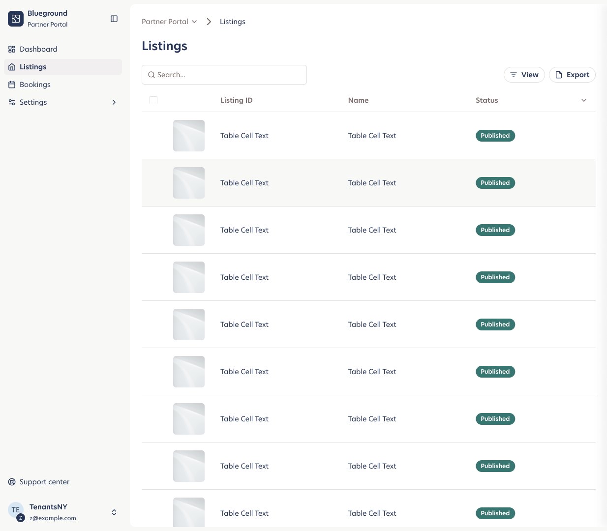
Partners are operators, not consumers
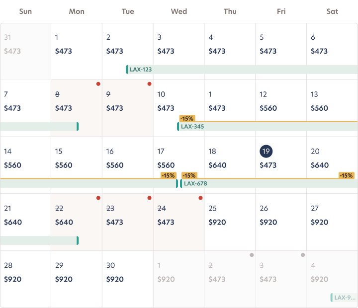
Blueground's partner network was growing, and partners were running dozens of listings through tooling that wasn't built for them. Key information about a listing or a booking was scattered, hard to find, or missing entirely.
Treating partners as operators and suppliers changed the brief. They don't need delight first; they need density, speed, confidence in the numbers, and a clear signal when something needs their attention.
Build on shadcn, make it ours
Instead of extending a legacy UI, I chose to start the portal on shadcn/ui: accessible, composable primitives that engineering could own in code. Then I branded it with our own typography, colour and component styling so it felt unmistakably Blueground.
That let a small team move fast without forking a design system, and gave us a foundation we could extend screen by screen.
Navigation that scales with the business
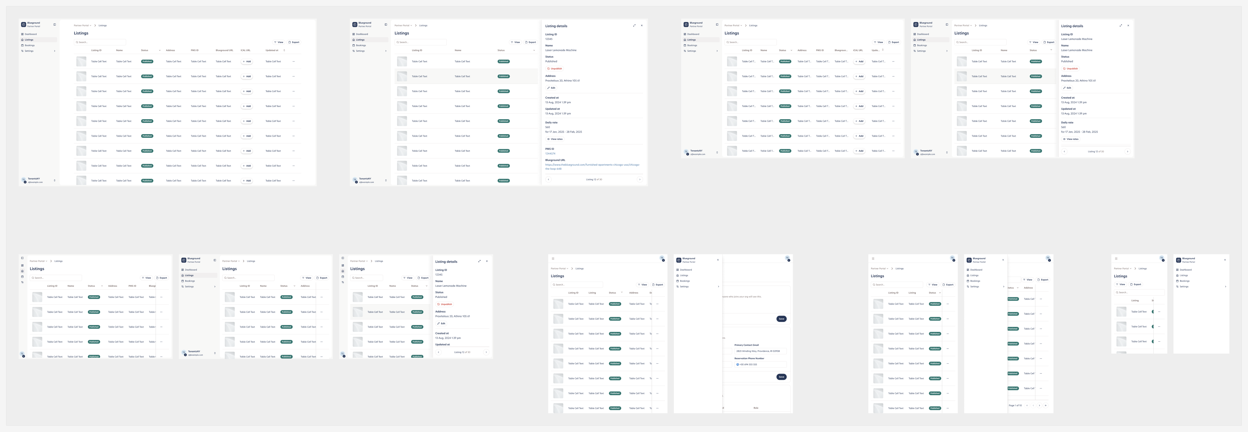
I started with the IA. I mapped every job a partner does, then designed a sidebar, breadcrumbs and scroll behaviour so the navigation that works for five listings still works for five hundred. Scroll through the exploration:
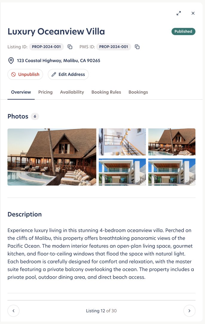
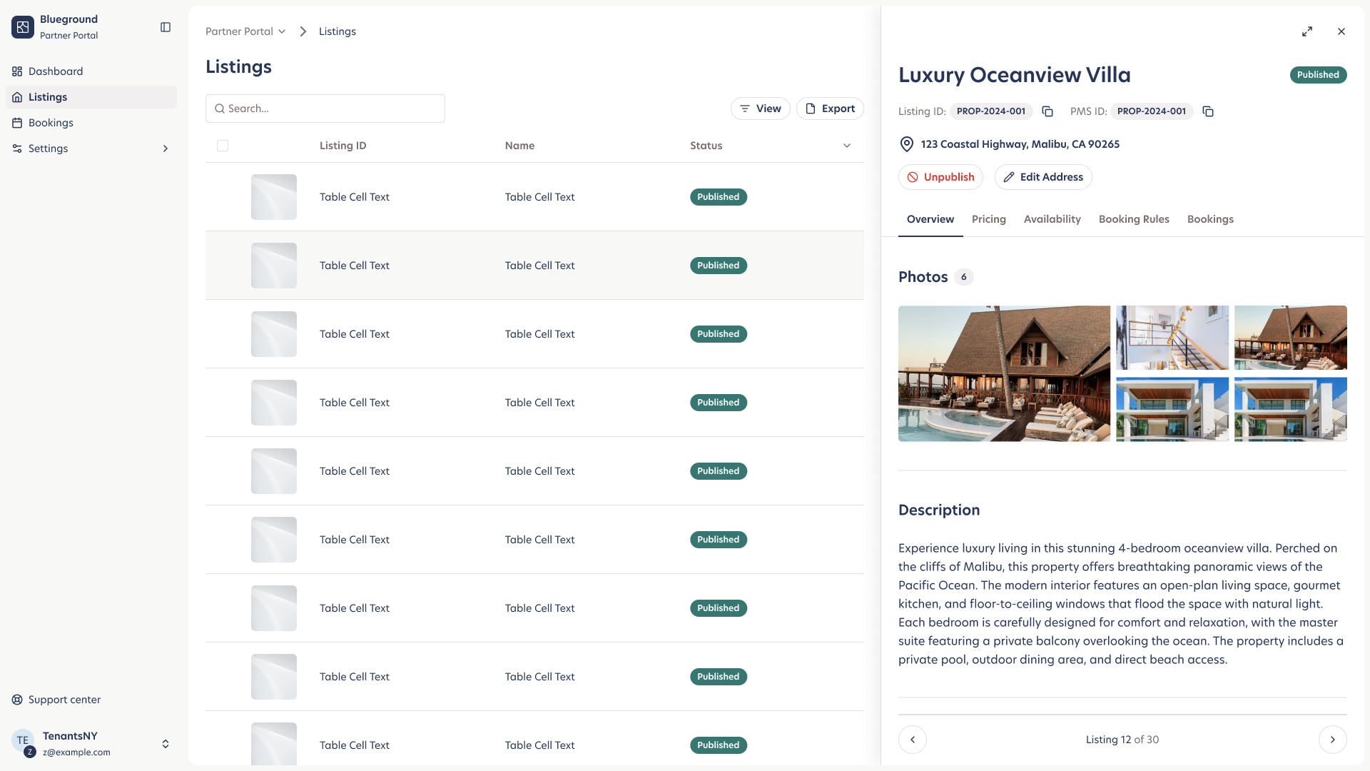
Stay in the list, go deep in the panel
Partners work across many listings at once. So instead of sending them to a new page for every record, a side panel opens next to the table. They can scan, open and step through listings without losing their place, and expand to a full page when they need room.
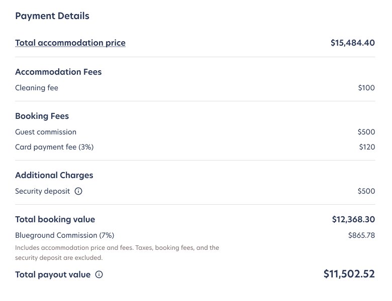
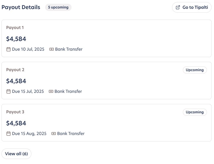
A booking page that explains every euro
The most common partner questions were about money: what was charged, what Blueground keeps, and when they get paid. The booking page answers all three in one read.
Selling the redesign internally
A redesign of a revenue-critical tool needs more than a Figma link. I produced a short motion walkthrough for stakeholders across the business that tells the story in six chapters, from navigation to settings, and closes with what comes next.
A foundation, not a finish line
The portal now carries the roadmap: partner-facing engagement metrics on the dashboard, bulk actions and status insights for large portfolios, and migrating all partners from Nestpick into one platform.
To add: adoption / support-ticket / partner NPS outcomes