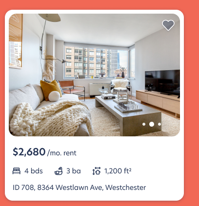
A crowded short-stay market, and an open long-stay niche
Competitors were crowding the short-stay space. Owning the long stay was a way to stand apart, but in interviews, people who weren't specifically looking for furnished apartments didn't realise we fit their use case. There was a gap between what we offer and the rental mental model people arrive with.
Watching people rent, from the homepage to checkout
- Interviewed 17 people who were not specifically looking for furnished apartments.
- Explored their needs, frustrations and preconceptions about renting.
- Had them use the Blueground website from homepage to checkout, and asked what would make it feel like a place to live, not a short-term stay.
Five themes, mapped to the moments they happen
We placed every quote on the journey at the exact touchpoint where it came up. That turned a research report into a design roadmap:
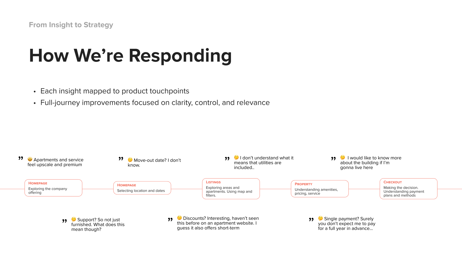
Protect what works. Fix the moments that mislead.
The first theme was good news: the brand already felt premium. The design response was deliberately no change. Instead we committed to protecting that perception in every solution and avoiding downmarket signals in copy, imagery and UI.
The other four themes each got a targeted response across the journey:
- Filters that match a long-stay mental model: bedrooms, price and home type up front, adapting in real time to the length of stay.
- A monthly pricing toggle, so guests see a true monthly total, fees and utilities included, while browsing.
- Listing cards with less noise: confusing utility mentions move to the property page, where they can be explained.
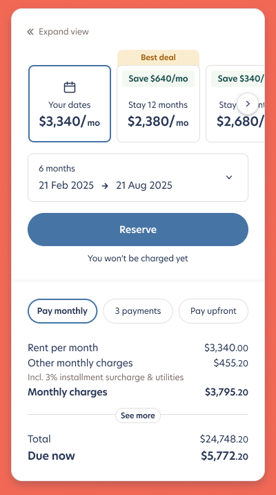
- A pricing breakdown redesign that separates monthly from upfront costs, and defaults to monthly payments for stays of six months or more.
- Building context and a structured FAQ on the property page, to reduce the need for a viewing or for contacting support.
Two pricing directions, tested head to head
For the highest-stakes component we designed two options, then compared them for clarity and confidence to convert.
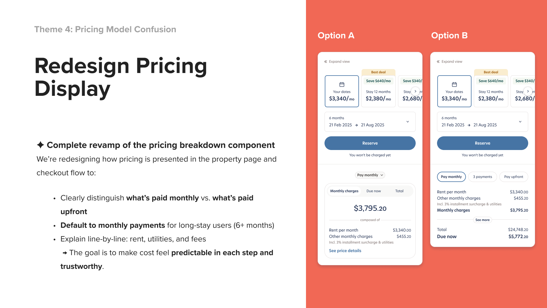
Tested in three steps
- Moderated interviews on how people read the current and proposed breakdowns.
- Unmoderated usability tests comparing concepts for clarity and confidence to convert.
- A/B testing of the final two versions against booking conversion.
Conversion improved after release. To add: figures
Sometimes the best design response is restraint
The most useful call in this project was deciding what not to change. Naming "perceived as premium" as something to protect kept every later decision honest: no discount-style urgency, and no clutter that would make us look like a listings site.