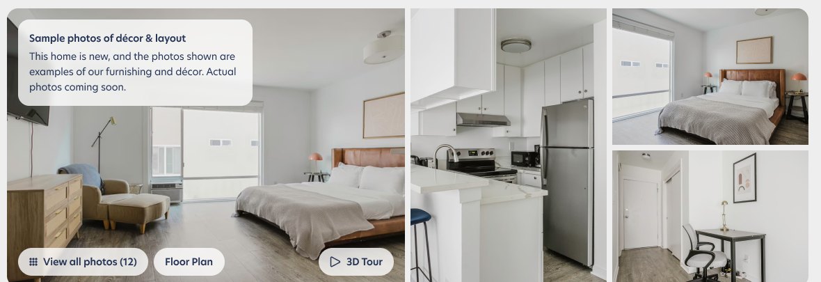
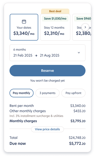
A premium product, presented like a spreadsheet
Guests told us Blueground felt high-end and trustworthy, but the listing page didn't carry that feeling. The photos competed with the details, the price was hard to read for long stays, and the questions that decide a rental ("what's included?", "what's the building like?", "how do I pay?") were buried or missing.
Image first. Price honest. Nothing left unanswered.
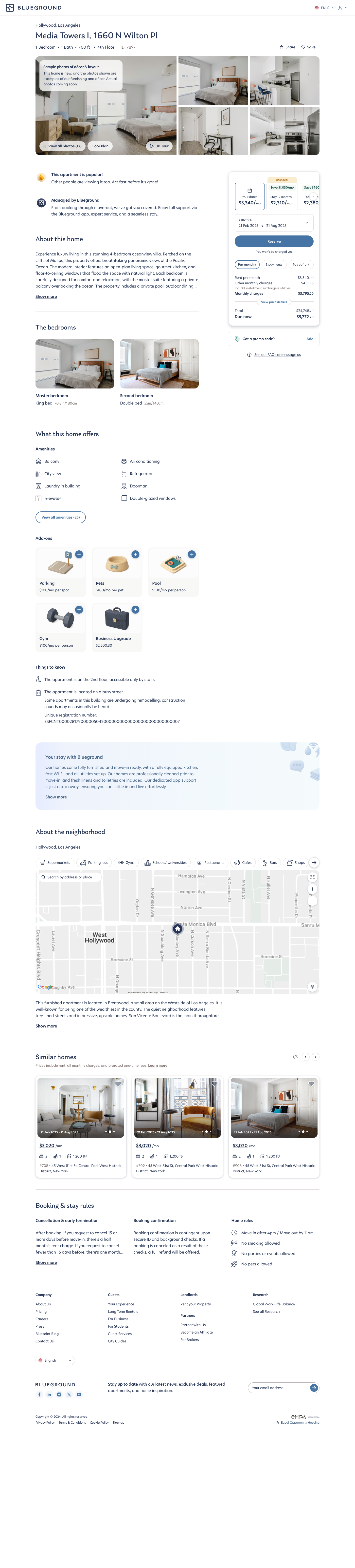
Scroll through the page to see how each principle shows up:
One card, three honest states
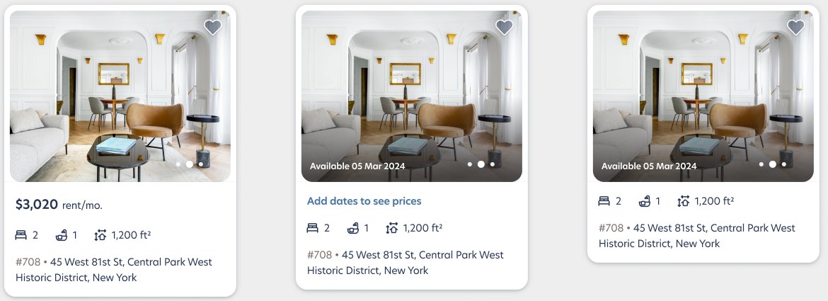
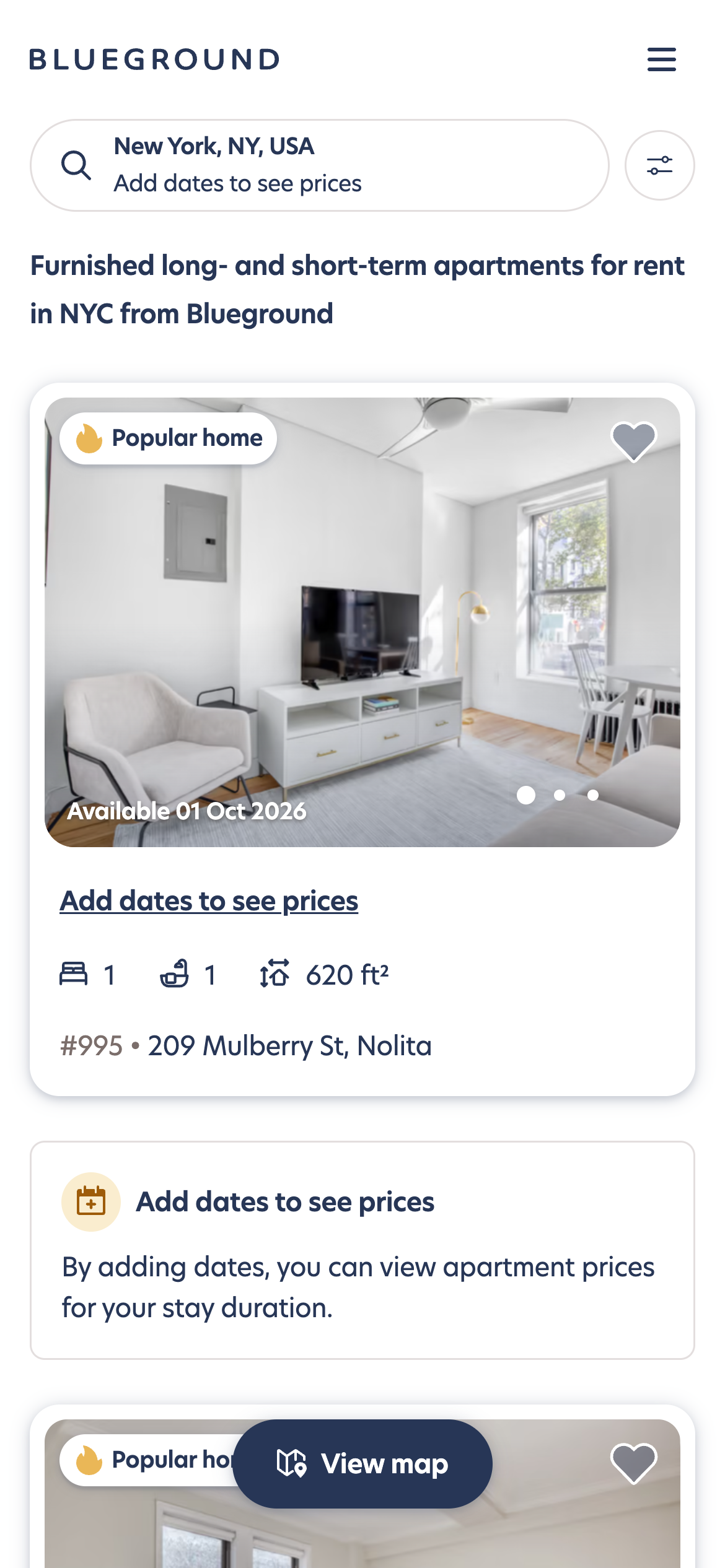
The listing card is the most repeated element in the product. I designed it to show exactly what we know, no more and no less: a price when dates are set, a prompt when they aren't, and availability first when that's the deciding fact.
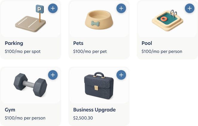
Add-ons that feel like part of the home
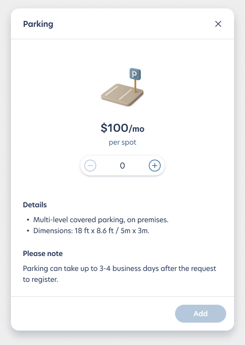
Parking, pets, pool, gym and business upgrades used to be an afterthought. I designed them as a tactile card system and specified every state: hover, selected, quantity, disabled, loading. Each has a details dialog, so guests know what they're adding before they add it.
Designed for every screen and language
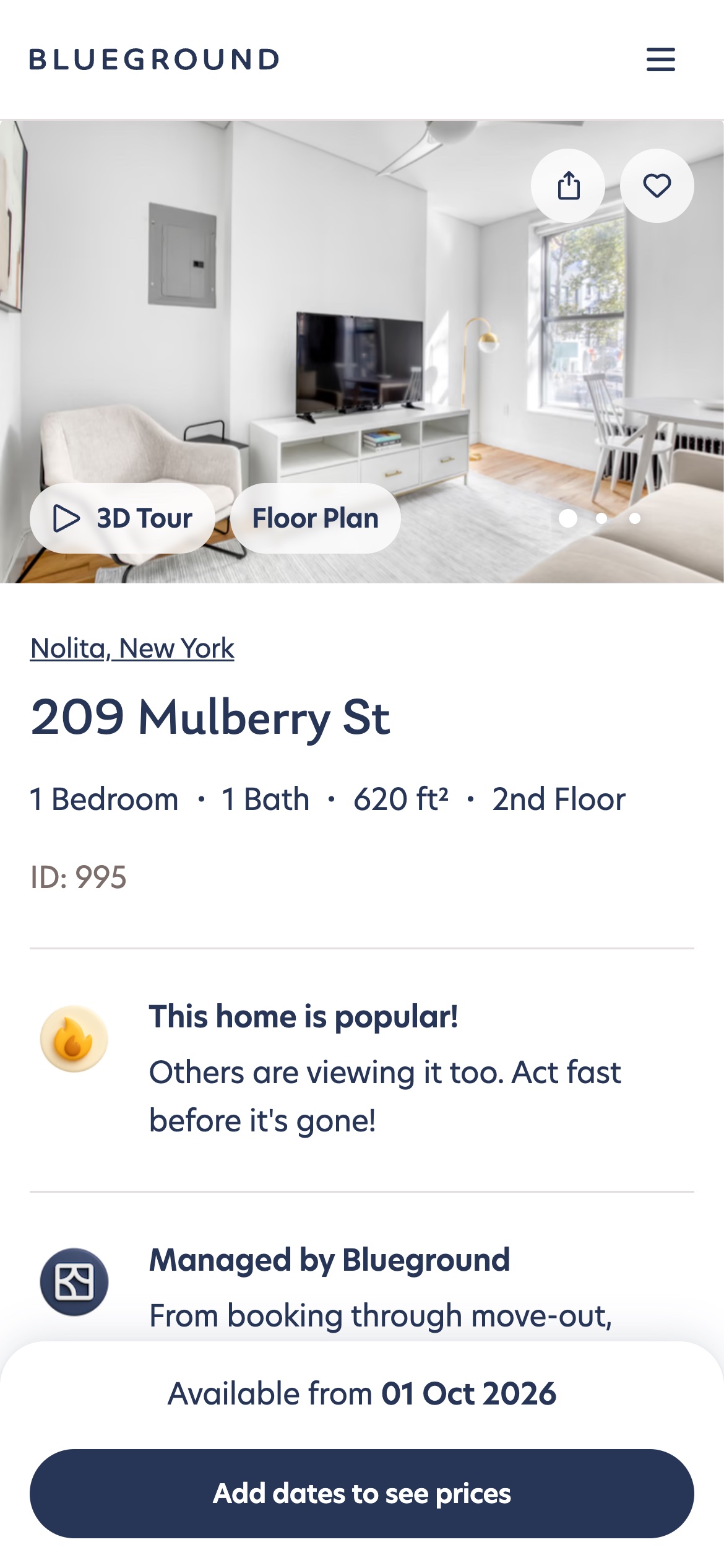
The page ships across five breakpoints and several languages, with variants for promotions and headers. Mobile got its own layout, not a stacked desktop.
The new quality bar for the guest journey
The redesign is live, and it became the reference for the rest of the website. The 2026 design vision carries its visual language forward into the booking flow and the corporate experience.
To add: conversion / engagement results